
 |
| Our newly-painted front door. The yellow and blue flowers are actually hair clips. |
Ever since tackling the ghastly-green living room, I've been pumped to splash some colour around.
In fact, these are all projects that I've been contemplating since last winter, but I waited until Steve was retired, so he could help with some of the installation and heavy lifting.
LIVING ROOM UPDATE
First, an update on the living room. I still love the paint colours - Benjamin Moore's Wickham Gray and Knoxville Gray. After playing around with which picture to hang where, we ended up with this.

Before I move on to the other paint tasks I've tackled, though, I want to show you a WAAAAAY before picture of this fireplace when we first bought the house.

We've come a long way, baby! The original mantel was a wee slab of marble, and the hearth was just four ceramic tiles, and the whole thing was unsafe to use and just leaked hot air into the cold winter. There was no efficient insert, there were no book cases.
(Though I will admit that the original off-white was much better than the ghastly green. You learn as you go along, right?)
A WELCOMING ENTRANCE
One of the things I had trouble with about this house was its weak curb appeal. It's not ugly, but it just looked tired. I tried spicing it up a little with furnishings.

But it still didn't really pop. Too much black and white. And it was even worse in winter.
(Actually, if you look at my Home Decor board on Pinterest, you'll see that I have pinned a lot of blue-turquoise pictures.)
 |
| The lower half of the side window is covered to keep Kane from barking at every single thing that passes by. |

The colour is called Bahaman Sea Blue, and I luuurv it.
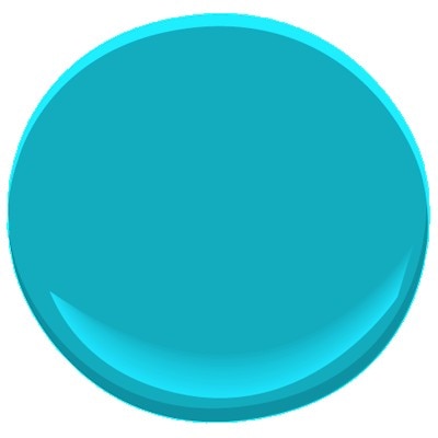 |
| Benjamin Moore Bahaman Sea Blue |
I'll let you know if I hit any hiccups.
DECK THE HALLS
Ever since I saw this pin on Pinterest, I've been itching to paint our pantry door.
 |
| This door is from Debbie Doo's blog. |
I don't think I want to turn it into a grand entrance or anything, but a bit of colour would be welcome. Here's what we started with.
 |
| The front hall the first time we saw the house. |
However, I did not want to carry that bright turquoise into the house. It would be so bold it would give me an eye-ache. Instead, I took the Knoxville Gray and the Wickham Gray from the living room and kind of split the difference.
 |
| All colours are Benjamin Moore |

Because the doors are exposed to different lighting, they actually look like I painted them different colours.
Ruh-roh.
Here's the view from the living room.

And from my divot on the couch.

I like how it carries the blue-grey into the hallway, but I'm not 100% satisfied with it. We'll see.
WHAT'S NEXT?
I'm so happy with the Wickham Gray that I'm thinking of painting the kitchen and halls that colour. The previous paint job is now more than four years old and is not wearing well in high-traffic spots (like by the garbage can in the kitchen).
But we'll see. It won't happen before I get back from my Big Adventure, which starts in SEVEN DAYS!
Ooh, I wish I could fly you here to paint things in our house. You have such a good eye for colour. I feel overwhelmed by all the options and so never paint anything!
ReplyDeleteI've done a good bit of trial and error, and the results aren't always quite what I intended, but it's easily enough changed, right?
DeleteI am loving watching all your progress!! And that is the same shade of blue that I have in one of my bathrooms. It is paired with white, and a couple of sea-foam green accents -- it's a beach theme. I'd love to do the whole house like that, but perhaps a bit much. The front of the house looks very nice. Ugh.... my whole house needs fresh paint. We've never painted since we have lived here: 11 years!
ReplyDeleteOoh. That would be a pretty beachy theme.
DeleteAnd be patient with yourself. The only reason I have the energy for this right now is because I'm retired and my kids are young adults. (They still take some energy, but it's not the same as having youngsters.)
Ok, I love all your colours Wynne Anne and that fireplace wall is amazing - what a transformation!
ReplyDeleteThanks, Heather! I'm really happy with our changes.
Delete