
 |
| Frank Lloyd Wright, Chicago, Illinois |
At the end of October, Steve and I drove down to Naperville, just outside of Chicago, to visit my brother and his family. While there, we took a day trip into Chicago to visit Frank Lloyd Wright's first home and studio.
Frank Lloyd Wright was the architect/artist who launched what became known as the Prairie School of architecture. The buildings he designed are landmarks and well worth a visit if you find yourself near one.
Chicago has a number of his designs available to tour, but I thought it made sense to start with his first efforts, and I'm glad we did.
We arrived at the tour location a little early, so we walked around the Oak Park neighbourhood to pass the time.
While walking, I learned something about Gingko trees, common in this area.
 |
| "Unpleasant," in this case means "fecal." |
 |
| One of his earlier houses. You can tell by all the vertical lines and the shallow eaves. |
 |
| Here we see the deeper eaves popular in his work. |
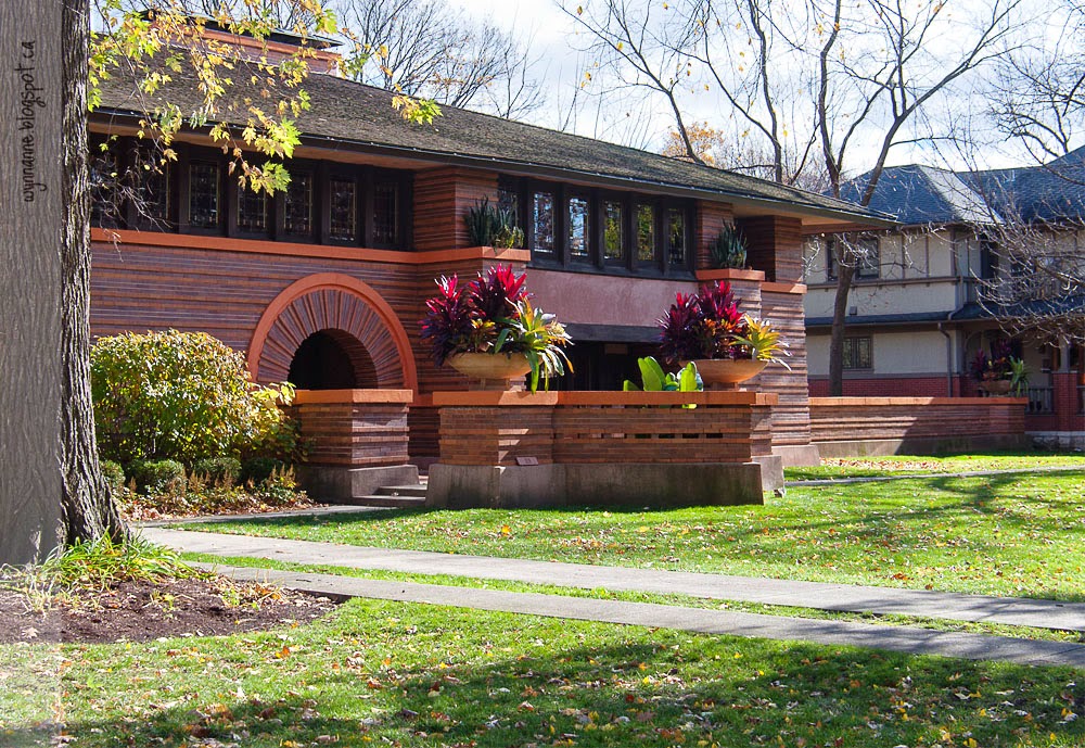
His philosophy was that the architecture should match the landscape which, in this case, was flat prairies. This was a dramatic contrast to the contemporary Victorian or art nouveau style of the period.
 |
| The Victorian house next to Wright's home. |
 |
| Frank Lloyd Wrights first studio (at left, hidden behind the tree) and home: again, we see the building-block style of stacked shapes. |

With limited funds, Wright was limited to a relatively small footprint for his home, so he made maximum use by including a lot of built-in furniture, including these uncomfortable-looking couches. (I'm pretty sure they would have to be generously heaped with throw pillows in order to be comfortable.)

He also filled the rooms with as much light as possible, using windows.
 |
| Dining Room |
 |
| While seated, one could not see out the windows. |

The walls were covered in bland linen cloth to minimize any distraction.
Apparently, this level of detail was incorporated into all of his designs: the windows, the wallcovering, the dishes, the furniture, the linens. Every single detail mattered to him.
The fashions of the time were as ornate as the Victorian house next door, and he decided that they distracted from his perfect vision of clean design, so he compelled his wife (mother of their ten children) to dress in drab colours of his own design. He would not permit his patrons to have their houses photographed for publication unless the women were wearing clothes he designed as well.
Are you beginning to understand the asshole impression?
But there is no doubt that his artistry was epic.
 |
| Children's bedroom, with built-in wardrobes, an innovation for that time. |
The master bedroom was a little more elaborate, of course.
 |
| Fresco on the interior gable in the master bedroom, commissioned by Wright to evoke the spirit of the Prairies. |
 |
| The hall to the children's playroom. |

The playroom was probably my favourite room in the house. The window seats were designed quite low to the ground, so the youngsters could easily climb into them.

In the playroom, as in the rest of his house and studio, you see the basic shapes of the Froebel Kindergarten blocks he grew up with. You see these fundamental forms everywhere in his designs.

Yup. Even in the light fixtures.
Moving from the house to his studio, we admired the ornamented pillars on his office porch.
 |
| He designed the motif, but, if I recall correctly, couldn't afford to have them cast in bronze, so they are painted plaster. |
 |
| He designed the tilt-top architect desk -- an innovation. |
All in all, lots of interesting stuff to learn, and beautiful work to admire; it is worth a visit if you are in the area and have time.
To close out our afternoon in Chicago, we went to Millennium Park and saw "The Bean" as it's known.

This captivating sculpture is a magnet for tourists and photographers, especially on a sunny day.

This girl chose it as her photo spot for her Quinceañera (15th birthday celebration). I thought it was a bridal party until we noticed the colour and age. Holy smokes!
The reflective, curving surface makes for some fun pictures.
 |
| That's me in the red jacket, Stephen in the blue and grey, and my sister-in-law Mary Ann in the black car-coat and red gloves further back to the right. |

I'm always fascinated by artists who can play with this kind of distortion.
We did a little more walking around, then stopped for a yummy treat before heading home to Naperville. More about Naperville another time.
Is it weird that I like both the Victorian design AND the Wright? That's so very contradictory, but I find things that appeal to me in both designs. Perhaps it is that neither of them are remotely similar to the cookie cutter look of my own neighborhood. I like that they are unique.
ReplyDeleteI do, too, as well as art nouveau. And I live in a 1965 house that has almost no character.
Delete