Perhaps as I get better with my camera, I will spend less effort editing my pictures after I take them, but I'm not there yet. And, honestly, I kind of enjoy the process of tweaking - or even creating a piece of art that is photograph-based, but is not a photograph. Like this:
Not so long ago, I lamented that I felt "consciously incompetent" concerning my skills with Adobe Photoshop and Illustrator. I've learned a lot in a short time and I'm enjoying plying those skills. I've also been able to transfer what I've learned on the real McCoy to Picnik, the poor-man's version of Photoshop.
Either way, I consider these part of the creative process.
So today, I want to show you some pictures before and after I've edited them. These were all taken in October 2007 on my point-and-shoot KODAK CX7530, my very first digital camera. In each of these pictures, the "before" shot had already been edited by the KODAK software that came with the camera. In those days, I did not save a "virgin" copy of my pictures. If the edit was an improvement, I overwrote the original. I don't do that anymore; I save them with a version number.
Nowadays, there are three things I do to almost any picture that strikes my fancy:
- Adjust levels - this often cleans up the "muddy" or "faded areas of the picture and even brings out detail
- Adjust curves - this usually brightens the highlights and deepens the shadows, creating more contrast, but I've also used it to brighten the midtones without losing contrast or creating too much noise.
- Sharpen - I don't always do this. Portraits, especially, sometimes benefit from a little fuzziness. Especially for those of us 40 years of age or over.
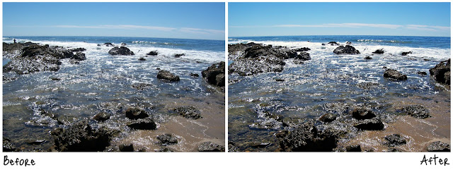
Here we go. I have seven pictures for you, all edited in Picnik. [Note: clicking any of these pictures will put them into a slide-show viewer.]
 |
| Wow! I liked the before version a lot - even have it printed and framed somewhere, I think, but the after picture really captures the contrast between the wet and the dry, showing off the textures. |
 |
| This is one of my all-time favourite pictures and, until I edited it today, I hadn't thought about how it could be improved. The main reason I like it is that the beautifully textured stair railing draws your eye right to Stephen, whose body in mid-stride shows the contrapposto that is so hard for artists to show in their work - the way the body balances itself. In addition to adjusting the levels, curves and sharpness, I also edited out Peter. Not because I don't like him, but because he distracted from the composition: his shirt blended into the sand and so it looked like Steve was striding happily towards a pair of legs and a disembodied head. |


I would love to know how to use picnik better!
ReplyDelete