
 |
| Primed and ready for the test paint! (iPhone pictures, so don't judge.) |
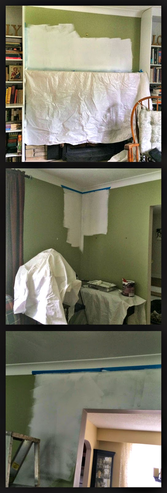
As I mentioned in an earlier post, I had bought a sample pot of Wickham Gray, a colour that I had really admired at my sister's house and which I had seen praised by designers.

It's a cool grey, with blue-ish undertones. I selected three spots to test my colour:
- The darkest corner in the room.
- Above the arch to the dining room. This receives the most light from the large picture window, but also has lamps directed at it.
- Above the fireplace, as I had concerns about how the colour would compliment the mantel and stone hearth.
After priming with white paint (ceiling paint, if you must know), I excitedly applied the Wickham Gray. Aside from being really impressed with how well the Benjamin Moore paint went on and covered, I was really happy with the colour.
In the afternoon light, the darkest corner was much improved.
 |
| GAH! That green looks positively vomitous! It's not really that yellow in real life. The colours are really hard to capture in these pictures. |
The arch to the dining room was brighter.
 |
| See just how much cheerier the dining room is? I wish I could get that light into the living room! |
And the fireplace wall looked fine, though Steve said he wasn't too sure.
 |
| Grey wall with bisque mantel. |
But as the sun began to set and our lights came on, something happened. The dark corner still looked better.

The arch was fine.
 |
| Muuuuuch better in grey. Much. |
But the fireplace! Cue the sad trombone: womp . . . womp . . . wommmp.

As I looked in from the dining room, it suddenly seemed that the bricks in the surround looked dingy, like they were smoke-stained or dirty. They hadn't looked like that with the green. And I knew they were as clean as they were going to get, as I'd scrubbed them with brick cleaner earlier.
The mantel itself was okay, but the bricks . . .
 |
| Ignore the splotches of white paint from the original wooden mantel. Getting rid of those is on my to-do list. |
And that impression only got worse as the evening wore on. It was enough to make me want to white-wash the bricks!
Steve has suggested that we paint that small bit of wall a different colour, but I'm not sure. I'd prefer to have the room all one colour. In either case, I'm really glad I spent the $8 on a sample, and that I painted several spots in the room.
I might try one of these from the designers quoted on the Satori blog:
 |
| Even from these digital samples, you can see how much better they would compliment the brick. |
UPDATE: today, with an overcast sky and no artificial lighting, the Wickham Gray looks fine, of course. But I have to trust what I saw last night. I'm leaning toward putting an accent colour over the fireplace, as Stephen suggested. (I should listen to that guy. He isn't always wrong.)

Next up: another sample pot! And without delay because the living room currently looks like this. Ugh.
 |
| Messy and crowded. |

No comments:
Post a Comment
What did you think? Any comments?